Design of the Times
Evolving technology and ever-changing market behaviors make it difficult to stay on top of the latest website design and functionality trends. Here are six strategies direct selling companies can implement to create a unique and effective website experience.
1/ Memphis Design
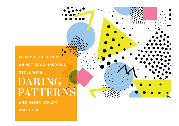
Some direct selling websites can feel a little too vanilla. One of the most popular design concepts to incorporate bold colors and out-of-the-box elements is Memphis design. It’s an art deco-inspired style with daring patterns and retro color palettes. Some designers refer to it as a bit gaudy, splashing some chaos and various shapes together. The overall look might bring some 1980s vibes since the style is named after a 1980s Italian design group.

“Memphis styles work exceptionally well for website design, particularly because they need to grab someone`s attention from afar. To put it simply, it`s fun. It`s a pop of color and vibrancy in a monochromatic, minimalist world,” explained Bashooka, a graphic and web design blog.
2/ Hero Typography
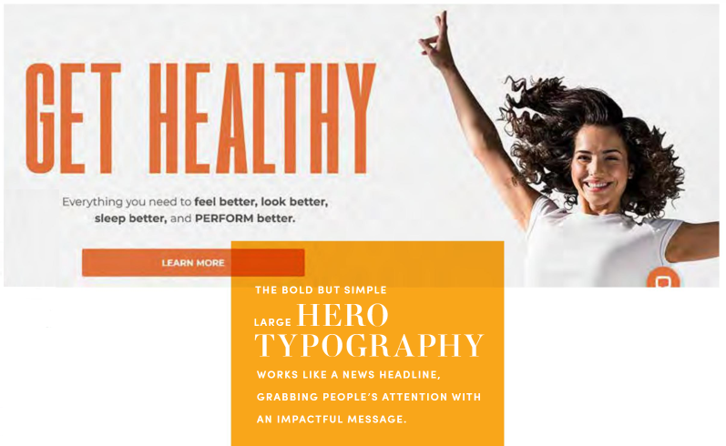
The bold but simple large hero typography works like a news headline, grabbing people’s attention with an impactful message. Focusing on hero type reduces or, in some cases, eliminates images on the page. They are typically sans serif fonts. Many sites incorporate dynamic scroll elements and animation with hero type. This is commonly used to slightly overlap images to create a sense of depth. It’s also terrific for highlighting quotes, testimonials or to convey a slogan. Here are five benefits of hero typography affording to Design Hack:
- Clear focus and understanding for the design
- Potentially more room for words
- Visually disruptive homepage that will catch attention because it is different
- Works on any screen size without having to think about different crops
- Can flow well with other design elements such as small animations, sound or bold color

3/ Visible Borders
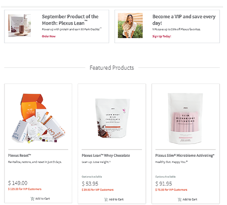
The perfect example of zigging when everyone else is zagging is incorporating visible borders and grids. This design strategy separates sections and builds clear boundaries. It helps direct a visitor’s eyes like a traditional magazine layout. Borders pair well with retro tones, such as the Memphis style described earlier. It incorporates gridlines and is more prevalent for a widescreen desktop experience. While symmetrical grids are the most popular, erratic placement of borders can also create a unique experience. Images can float over borders in scrolling effects, combining the popular parallax style with a more traditional border layout.

“Thin gridlines are the most popular by far—they’re least obtrusive to the eye—but thicker lines can make a bigger statement if that’s on-brand for a company or product,” according to New Media Campaigns. “Thicker lines tend to read as more of a hard throwback, whereas delicate lines acknowledge the trend without having it define the entire design.”
4/ Interactive Elements
Video and drop-down elements are nothing new, but are becoming more popular with site designs meant to immediately capture a visitor’s attention and encourage them to interact with the site. A popular strategy for direct selling companies is to use a continual loop video of field distributors at events and incentive trips to communicate culture. Try placing a looping background video near the top of the homepage.
Interactive cursors and drop-down elements that reveal hidden content create a unique experience that compel visitors to discover secrets, information and keep them on the site longer. Cursors can also move or rotate elements on the page, creating a game experience. GIFs that cycle through a sequence of images (known as “cinemagraphs”) can be eye-catching on a page paired with stagnant imagery.
“Interactive websites either respond to a user’s interaction or guide the user journey with captivating animations, videos and other interactive elements…” said a post by Hubspot. “This type of website does more than delight users—it helps keep them engaged on the site for longer.”
5/ Moving type
Animation and eye-catching movement are not limited to video images. Moving type, also called “kinetic typography,” adds to the interactive experience. Typically, this is when the text enters the screen as a visitor scrolls or when the text follows along with cursor movements. With some features, users can control the speed and direction of text movement, creating a unique animation of its own.
“Moving type is going to be a big trend. We live in a digital world and it’s cool to see some fun ways of taking advantage of this in the world of typefaces to create living breathing letters,” shared Arian Bozorg, Community Engagement Manager at 99designs.
6/ Scrolling Animations
Scrolling animations are becoming the norm instead of a rare feature, especially with web design software making it much easier to incorporate. Parallax effects, for example, create a sense of depth and encourages the visitor to keep scrolling. It creates an experience of the visitors controlling site as elements come together or activate as they scroll. These features work well with company timelines and detailing product benefits. (Example site from photographer Nolan Omura.)
According to Hubspot, scrolling effects “are increasingly used on interactive websites to intrigue readers to keep scrolling, signify a break in content, and create a three-dimensional experience.”
From the November 2022 issue of Direct Selling News magazine.


